Wednesday, October 22, 2014

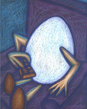
The Mummy

This image is available for sale on ebay:
http://www.ebay.com/itm/261631030157?ssPageName=STRK:MESELX:IT&_trksid=p3984.m1555.l2649
Could there be a more famous horror character than the cursed Egyptian mummy returning from the dead?
I think not!
The entire process of Egyptian mummification was to house the "ka," the one part of us that will live on in the afterlife. For the ancient Egyptians, taking care of the ka was extremely important for the afterlife. Their entire life on this planet was a preparation for the afterlife and each person's "ka" needed some sort of a vessel or shell to house it. During mummification, every internal organ was taken out of the body and placed in canopic jars except for the heart which was the seat of the "ka." The heart was placed back inside the wrapped body that we call a mummy.
The concept of a "ka" was much more complex than the Christian soul. In fact, the idea of a soul was only one of eight parts of the "ka." Your personality was another of these parts.
Every thing an Egyptian did in this life would affect the "ka." and a person crossing over to the underworld would be judged by Osiris to see if they had lived a good life or a bad life. Your "ka" inside your heart would be placed on a scale. The feather of Maat, (the Egyptian goddess of truth) would be placed in the opposite scale. If your heart (ka) was lighter than the feather, it meant you were a good Egyptian and would remain in your shell body in the underworld. If your heart was heavier than the feather, Ammit the Egyptian god that was part crocodile would eat your ka and you would wander the underworld as a lost soul. (or what we would call a ghost)
 This image is available on ebay:
http://www.ebay.com/itm/261631030157?ssPageName=STRK:MESELX:IT&_trksid=p3984.m1555.l2649

Monday, October 20, 2014

Gargoyle

http://www.ebay.com/itm/251683352618?ssPageName=STRK:MESELX:IT&_trksid=p3984.m1555.l2649
We love the demon-like monsters called gargoyles because they remind us of our medieval past filled with mystery and intrigue. Gargoyles go with the Gothic world perfectly because there was so much mystery in this European past. They still influence our minds today so much that they've become a symbol of medieval horror. Did you know we get the word gargle from this creature called the gargoyle? In fact, an authentic gargoyle is a functional part of a Gothic cathedral. It drains the water off the roof through its open mouth. Most of your medieval Gothic gargoyles have open mouths and they are situated near the roofs of these mysterious cathedrals. The term Gothic, itself, is a misnomer because the Goths had nothing to do with this design style or the monsters that guard them. Medieval French architects called this style "modern" because it was the newest or freshest architectural style at this time. The rest of Europe called it the French style since the first one was designed in France. The pointed arches were inspired by the Islamic architecture the Knights of the Templar saw during the Holy wars when Europe sought to control Jerusalem. The stained "jewels of light" were a symbol of God's light entering into their suffering years of darkness. Abbot Suger, the creator of the first Gothic cathedral, read Aristotelian theology and began associating light with God...
...just like the Middle Ages had to experience the dark first in order to welcome in the light.

This image is available for sale on ebay:
http://www.ebay.com/itm/251683352618?ssPageName=STRK:MESELX:IT&_trksid=p3984.m1555.l2649

Sunday, October 19, 2014

Fall Forest

This image is available for sale on ebay
http://www.ebay.com/itm/261631036502?ssPageName=STRK:MESELX:IT&_trksid=p3984.m1555.l2649

http://www.ebay.com/itm/261631036502?ssPageName=STRK:MESELX:IT&_trksid=p3984.m1555.l2649
Fall is my favorite time of year. Houstonians finally get some relief from the heat that plagues us 6-7 months. There's a saying that Houston has two seasons: hot and hotter. Although some people up north are experiencing their first snow fall, we're grateful in the south to be out of the 90s. We've yet to receive a cold front but the two cool fronts that have managed to reach us feel great.

This painting was made in honor of this time of year. I love October because the September heats are over and the holiday hype has not kicked in. It's the time to get outside and enjoy the parks. You can expect to see a lot more photography on this blog in the weeks to come.

This ACEO (Art Card Edition and Originals) is almost shown in the actual size. There is only one rule for an ACEO and that rule is that it must be 2 1/2" x 3 1/2" or the standard size of a baseball card or deck of cards.
 I love painting miniature art like ACEOs because they are challenging. Not everyone can paint skillfully so small. "Sure, we're always impressed when a work of art is huge but it is also equally impressive when an artist can show skill at the miniature level." (That's actually a quote from an art history book!)

I painted this with watercolors on 140 pound Strathmore paper. I then added gouache paint to the trees in the foreground. Gouache paint is an opaque watercolor paint that used to be called the 'student's paint' because it was so cheap and easy to mix. Several famous artists (like Jacob Lawrence for one) have made it more famous so it's not as cheap as it used to be. Artists in India have used gouache for centuries in their manuscripts so it is not just an American paint. I love this paint because it is so versatile and mixes well with other media. It allows me to keep the translucent background while painting the foreground thick like a dense forest.

thanks for looking and please check it out on ebay:

http://www.ebay.com/itm/261631036502?ssPageName=STRK:MESELX:IT&_trksid=p3984.m1555.l2649


Sunday, October 12, 2014

Skyscrapers

(photos by dianne curtis / all rights reserved)

The skyscraper was America's contribution to the world of architecture. Did you know that in order to invent the first skyscrapers, we had to invent the elevator first? That makes sense...right? The Romans could have invented skyscrapers but buildings that were taller than 5 stories were not logical for everyday business practices.
You're looking at one of Houston's most famous and distinguishable buildings now called Heritage Plaza. It was finished in 1987 when Houston was suffering from the oil crunch, unemployment and premature over-expansion so it stood as one of the last, tallest buildings to be built in Houston for over a decade. The main architect behind the design, (M. Nasr) was inspired by the Mayan step-pyramids he visited in the Yucatan.
Another building with a bit of a "Dutch-Gothic" revival located in Houston is the Bank of America Center designed by Philip Johnson and John Burgee.
Like many of the modern skyscrapers in Houston, these buildings are so distinctive, the skyline in this city has become famous and easily identifiable all over the world...
but Houston has been criticized for not paying attention to the ground level of these beautiful towering entities that dwarf anyone walking under them. We don't really have the elaborate gargoyles or Baroque arabesques that other cities do along the east coast but it can be argued that Houston is a more modern city simply because it developed at a much later time period in history.
When the first skyscrapers were designed the idea of using nothing but reinforced concrete, steel and glass seemed disastrous. It wasn't until the perfection of steel manufacturing. stronger glass and reinforced concreted that allowed architects to solve all the weight distribution problems that are included with a huge skyscraper. This is why older cities like New York and Chicago have masonry work on the first few stories, this was the only solution for handling the weight and gravitational problems with building so high. As we perfected these challenges, our buildings became prettier. One architect who taught everyone how to really "dress up" up a building was Mies van der Rohe...but we'll talk about him on another day.

Wednesday, October 8, 2014

Stairway to the Sky


http://www.ebay.com/itm/261545482568?ssPageName=STRK:MESELX:IT&_trksid=p3984.m1555.l2649

This image reminds me of the song "Stairway to Heaven" which has been written up as one of the most famous and popular songs in music history. There's all kinds of trivia on the internet about the song since it is so famous. My favorite trivia is when the lyrics for the song appeared in a book titled, "'Scuse Me While I Kiss This Guy: And Other Misheard Lyrics by Gavin Edwards and Chris Kalb." They claim we've always heard the lyrics as "...and there's a wino down the road. I should have stole more oreos." when in fact what Led Zepplin is really singing is, "and as we wind on down the road, our shadow longer than our souls." Much deeper, right? 

I wasn't thinking of this song at all when I created the image, though. I wasn't feeling very spiritual or melancholy, either. I was simply frustrated with my students for not getting a perspective assignment correct. I created this as an example of how a stairway in the sky would look in perspective. Linear and atmospheric perspective are both used here to form the illusion of something trailing off into deep space.

In linear perspective all horizontal angles converge at a vanishing point which rests on the horizon. (that's really a traditional textbook definition) The horizon line (where the earth meets the sky) can be below the viewer's eye, even with the viewer's eye or above the viewer's eye like this image portrays.

Atmospheric or aerial perspective occurs when we stare out at the horizon and the detail of all the objects becomes blurry as if the atmosphere is absorbing the earth. (Which it is. We are viewing the curvature of the earth so we see the bottom layer of clouds obliterating the landscape)

Both of these devices, when used correctly, can give the viewer a deep sense of space.

This is important for 2-D artists because as illustrators of a concept, we must create the illusion of the third dimension. Our greatest challenge is that flat, picture plane and white canvas.

This image is available on ebay:


http://www.ebay.com/itm/261613694583?ssPageName=STRK:MESELX:IT&_trksid=p3984.m1555.l2649

Monday, October 6, 2014

The Layer I Used for the Bird House

The final layer for my bird's tree house was glued Popsicle sticks soaked in a powdered drink mix. It is extremely necessary to use safe dyes on the outer parts of the house because we know the birds will be chewing this layer.

I soaked everything in drink mix including the rolled perches, the rope string for their swing, the wooden ladder and the sticks. I chose a grape and cherry flavor for the pastel variety of shades seen above.

Mixing the grape and cherry together gave the sticks a more realistic wood stain which I used  on the roof. Varying the colors give it a more homemade look.

Popsicle sticks are cheap, readily available in all kinds of sizes and they stain well. You can even cut them into desired shapes for tight fits around windows, gables and roof ornamentation. 

One final note on this project is the stain itself. Even though this stain is non-toxic, it stained my hands very quickly (within a matter of minutes) and they remained stained for days. It really makes me wonder what we are consuming and giving to our kids to drink. All that dye cannot be good for our stomachs but it makes a great non-toxic stain for bird houses and it smells good!

Sunday, October 5, 2014

A Modular Home with a 'Skin'

This is a modular home scale model with a "skin' or outer layer. I used real glass and copper and then separated the layers of thick cardboard and salvaged the corrugation in the middle. this was painted black and then 'dry brushed' metallic green. 

This scale model was designed to take apart, as well. The corrugation was designed to simulate anodized aluminum. The whole idea behind these modular homes is to use nice material on nothing more than a box. I am not the first to come up with this concept. In fact, Mies van der Rohe designed the first 'international style' skyscrapers based on the theory that "less is more." Instead of creating buildings that were elaborate and highly ornamentational, Mies designed efficient, functioning, rectangular boxes using the finest materials available. The ornamentation was in the materials and how they were applied to this simple shape of a 3-D rectangle. Have you ever noticed why those simple 'box' skyscrapers that line are city skies are beautiful? It's in the materials they used to dress it up: polished bronze, smoky black glass, etc. The simple shape shows off these gorgeous materials.

My modular homes are designed for pre-fabricated evacuation sites when a disaster occurs. Instead of putting these homeless victims of hurricanes or fires into an ugly trailer park, these people can pick out the materials they want assembled for their modular home. Since the walls are prefabricated to the same size, they will snap together with a mortise and tenon system. When the evacuees are able to return to their homes, the entire modular home park can be disassembled, washed, treated and then moved on to the next disaster area.

The annodized aluminum and stone surfaces are designed to blend into the forest or other nature spot. The corrugation looks green from one angle and black from another. The polished walls of copper inside can slide to direct sunlight however the tenant desires.

Here are 3-D renderings of how they would look in a forest.


Here is my original sketch.

Saturday, October 4, 2014

A Scale Model without a 'Skin'

This is a scale model without a "skin' or outer layer. The corners need to be sharp and match evenly if you are going to show you scale model without the outer materials. 

This scale model is designed to be taken apart so you can see all the inside floors.


It is built using an architect's scale so the first floor is designed to have a 13' ceiling. The second floor is designed for a standard 7 foot ceiling and the attic floor-studio has a 6 foot ceiling except for the tower. (The tower is over 20 feet with a two story cat walk around the window. the lower part of the tower will have a giant utility sink and filter for proper dispensing of art supply waste.

Wednesday, October 1, 2014

Getting precise angles

I use a centering ruler for quick measuring. I use a steel ruler for cutting and scoring. there is a difference between cutting and scoring.

Scoring cuts the top layer but does not cut the bottom layer. You can score all paper and cardboard but you need to know how your knife and blade cuts. Sharper blades only need a tiny bit of weight. Dull blades are not recommended for anything. In fact, dull blades are dangerous for many reasons; it's hard to cut and judge the pressure needed which results in slipping, cut fingers and many other accidents.

Scoring lines need to be covered up later since they leave obvious gaps in the surface.